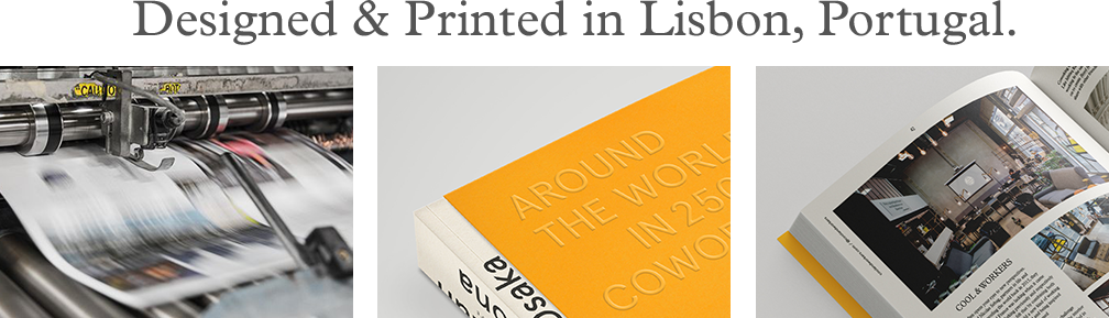
Approach
When I started working on this project with Pauline and Dimitar I immediately got contaminated with their love for this world-wide community of coworking. As we set out to find the best ways to represent the different sites, we understood that more than a compilation of spaces, this book is a collection of experiences, ideas, passions — It is not a travel guide in the traditional sense but a guide to inspiring stories and people. This led to conceptualizing a book that is kind of a hybrid in the sense that it combines in one object, characteristics that belong to different categories of bookmaking — big and shiny coffee table books versus practical and informative travel guides.
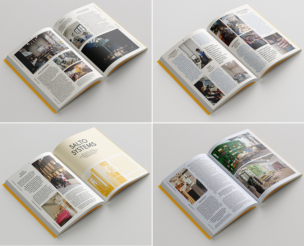
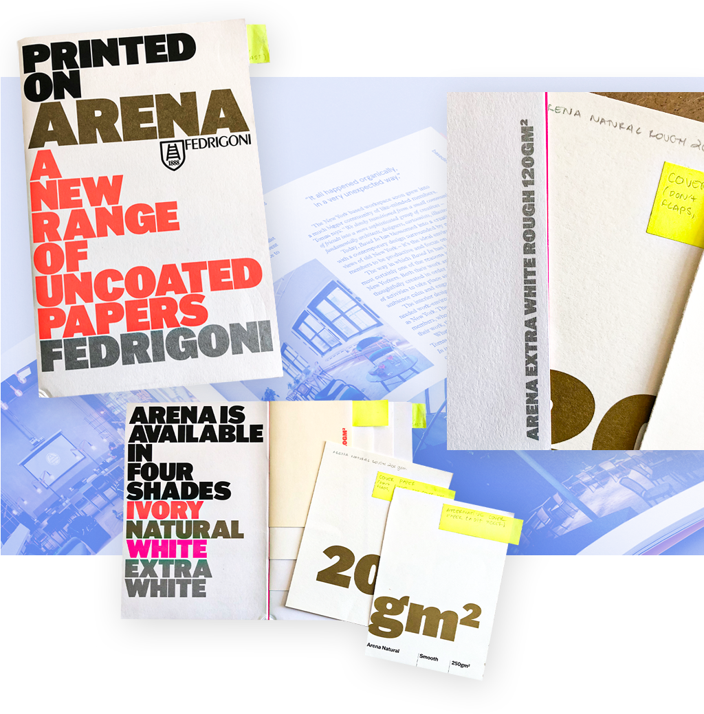
This duality is present in different ways: on the one hand a generous size with over 350 pages, profusely illustrated with images, carefully chosen materials such Fedrigoni’s Arena, in different tones and textures for a richer tactile experience, and finishing such as embossing on the cover; on the other hand, a softcover binding, two indexes that give the reader multiple ways to navigate the book, and lots of useful, easy to find information.
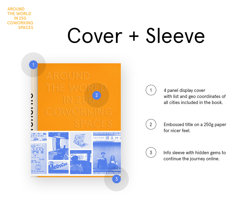
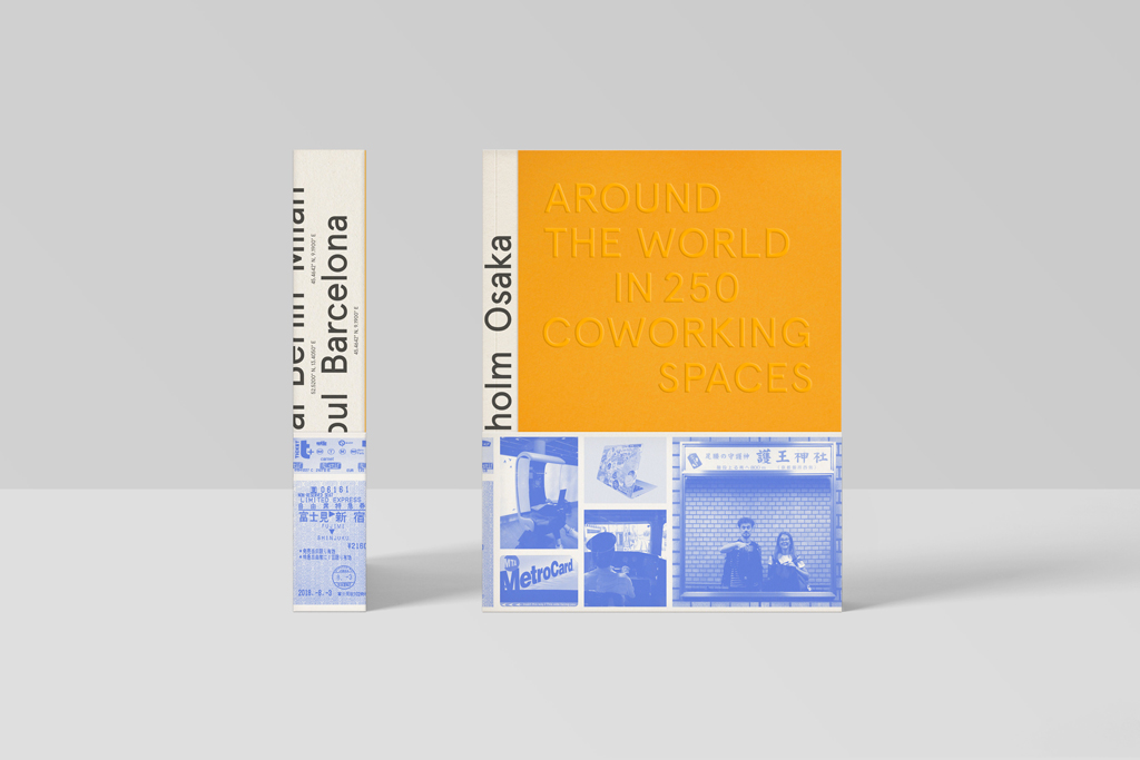
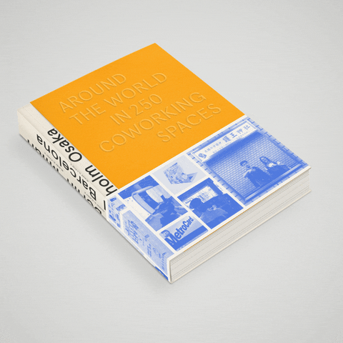
There are endless possibilities when it comes to present any given content on a cover, the challenge here was to have a fairly minimal and elegant cover while still suggestive enough that would reflect the big and diverse universe of coworking. After many studies and options, came the idea of taking the standard format of a softcover book (with flaps on the front and back folded in), but instead folding the font flap out, creating a multi-layered cover.
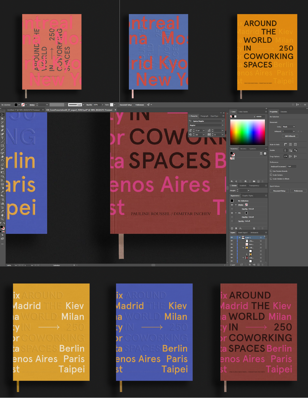
At first sight, the title is the most present element in a bright yellow background, but in the second layer is a list of different cities going around the book to the side and the back. To bring it all together we added a bright blue sleeve that references the traveling and gives a sense of the different themes addressed in the book — design, technology, work models, etc.
In the end, the result is, I hope, an engaging, playful object that reflects the very thing it is about — different people coming together to create and empower each other.
Sneak peek of the book 👇
The cover has been conceived as a design object, one that will beautify any shelf. Through its reverse flap, the book can stand upright when both closed or slightly open, revealing a glimpse of the cities the reader will travel to. The sleeve at the bottom of the cover gives you a sneak peek of what’s inside, while also allowing you to mark the page where you stopped last.
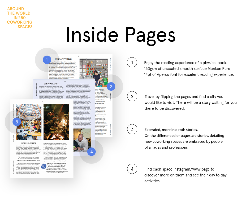
In its design, we gave the book a dynamic rhythm by varying the length of stories. From short to longer ones and insights pages, you’ll be able to learn new things every day, in just a few minutes of reading.
Book Specifications
- Format: 20.5x25.5 cm
- Weight: ~ 1.5kg
- Paper: Arena Paper by Fedrigoni (different grammage across the book, for an elevated feel & reading experience)
- Typography: Plantin by Frank Pierpont & Aperçu by by Colophon Foundry
- Pages: 350
Interested to follow up how the book evolves? Follow us for updates on Linkedin/Coworkies OR Instagram/Coworkies.